I ain't had time to upload any images of the work I did to change the guy in the scene but I rotoscoped myself doing the action and this is how it turned out in the end, after being put into the full video. Got some Great feed back yesterday from everybody which I didn't expect but shows that working hard works out though I do see some areas that I want change but that is from watching hundreds of times ha ha. Ill use this experience to improve my skills and put towards future projects.
Thursday, 2 June 2011
Sunday, 22 May 2011
Evaluation
I found producing work for some else not hard but difficult to in-vision what they wanted but was a good experience to how it would be to produce work under someone. This project allowed me refine digital animation skills, in drawing a animation from the start on computer instead of by hand on paper. Produce backgrounds for animations which I ain't done yet but I know I will definitely need for my final major project next year. I feel I've gained a lot from doing this because I know now that I can produce work at a faster speed than I could before.
Something extra
I got the bird to fly across the screen at different sizes to you it more than once and get to see the detail when it is closer up :D
Finished Animation
So this is the complete animation. I've thought to make it smaller and make it fly across the screen to see if it will work which I will post up soon.
Bird flying semi complete
I've coloured it all in and I am happy with the end result, Just need to edit the wings so the start point is all the same because it moves around too much
Bird Body Colour
I coloured in the body to get a idea of how it would look. I made it slimmer than the temp body of the line test because it was a bit too big
Bird references


Being my favourite type of bird for its colouring and how it looks, I thought id base the bird on a falcon.
Starting off Bird flight
I got the basic shape and added the wings over, i only put the 1 wing in just to get the main wing moving 1st, i was pleased with this and i would improve it by addingin the 2nd wing at the right points. This was my 1st animation drawn all digitally.
Test and Final Crater

This is the final which i sent to the l6 student, he didnt end up using this one because it didnt match his style of animation, i found it a challenge achieving this because i was unsure of how to get the roundness of the crater so you can see it. i used his storyboard drawing as a reference also.

This is just a test of achieving a round shape of the crater, the depth is lost and just looks a mess, I wasn't happy with this test but was just a see how it goes piece


Saturday, 21 May 2011
Wasteland Final

This is the piece I came up with and when I sent it to him he was pleased with it so that was one sorted :D, I quite liked this one because I tried various brushes in the Sketch Book Designer program to produce different textures.
L6 Referance


So this is what he wants his background to look like so i will sketch something out quickly and come up with something.
Final 1

So this is the final which I produced in the end, I sent it over to the l6 student but found this wasn't what he was looking for so I would have to re do it using the source material that he gave me, I kinda got confused on what he asked for because he said he wanted horrible looking scenery which is what I was slightly going for here.
Tests

This was my 3rd test which I did and was what I was considering to keep it as but i needed to add more greenery because I felt it lacked it and looked too bare, so I considered adding grass from the second to bulk it out, working with layers allowed me to do this easily.

2nd test I liked this one but i needed to have more detail in the background.

1st Test to sketched and didn't look like dead long grass, I did like the blurred affect at the back to show contrast in foreground and background.
I had to get used to working on my screen tablet drawing out the images to I did a few practices before I was able to know what would and wouldn't work for my work.
Research


I started off by viewing what the L6 student had done so far so I got a ruff idea of what he had done. I went onto looking at forest images and dead wasteland images because I was later on told that is what id be doing instead in contrast to the forest version
My Tasks
So I've been set to do backgrounds for certain shots in the animation and produce small animal movement animations. ill try to send tests and samples to get feed back on what to change and improve upon. ill be keeping in touch with my L6 student via Facebook and email.
Wednesday, 11 May 2011
style and effects for final


so I'm going for a very sketched look which I could do all using sketch book design which should look good when its animated, i have also experimented with a haze look on the image to cause a fantasy look to it. I think that would look good, showing it to my group we talked about it may need doing to the all of it to give consistence.
Animating 5
Edited the parts which needed it and this is the end product. I feel comfortable with this filming and the finished ink product should look good.
Technique's
For this piece I had to insure that I got the timing and spacing right, I gave a little anticipation at the beginning to cause the viewer to think what will he do. Exaggeration was key because fantasies usually are and I feel I got the right level of exaggeration in his actions
animating 3
I added the exaggeration but also removed the 2nd turn of the head back to keep the pace going because I felt it kinda slowed it down and wasn't needed. I changed the flex at the end slightly but still needs improving. I need to make him hold his head back for longer because its too quick at the moment and just looks weird.
Go Group!!


We communicate alot via facebook and texting. to regualy meet up and discuss whats going on and progress our project so lets keep it up!
Animating 2
I got the movement smoother flowing but it still needs some editing with the timing and his poses need to be a bit more exaggerated. so more gust going through his hair while he arches he head backwards and more flex of the muscle at the end.
Technique - Image replacement

I learned after awhile that I didn't always have to draw out everything but could just draw what was moving and add it to a full drawn image to speed up the process. It saved me having to draw it all and having to scan it all into my computer so was the technique which I used.
1st & 2nd Key Frame attempts

Style 2

Style 1
So this was both attempts which I came out with, the 2nd was much better defined so was the one I went with. the 1st lacked much to it so it didn't work for me when I animated it but the 2nd looks nice a clean and will be good to work with.
thought about the product

Target Audience - Aimed at women mainly
Previous Adverts - Are of women enjoying the chocolate bar and feeling good about it.
Our Concept - Same theme of galaxy ads but with a twist of a parody of the music video Take on Me.
Strap Line - Indulge In Your Tastiest Fantasy
Character Development - Using the Character from the music video but make him comical.
Colour Schemes - Mainly brown chocolate. I thought for the animated part of the guy it could be hazed to show it isn't real and is a fantasy going on.
Tuesday, 10 May 2011
1st animating test
So I had a attempt at animating my first drawings which i drew out but found that trying little short cuts that it made it look really cheap and not fluid in the movement so I would have to re do this and draw everything out but it hgave me a good idea of getting perspective right when drawing it out.
Take On Me Special
Looking at this was a big help on how they created the piece. And from doing it myself I only feel a small piece of the long progress of making the animation.
http://www.bbc.co.uk/news/entertainment-arts-11485702
BBC News report on the music video from it coming out 25 years ago.
Simon's Cat
I've always liked Simon Tofield's animation style for this series and the smoothness to it with very simple lines. I know that it was a good link to what i was doing being the piece which we was going to do.
Thought Of You Shortfilm
I looked at this video because it was very similar to how we was making our piece of watching someone do it and having to draw it so I found this piece inspirational to try and get it as fluid movement as possible when creating the take on me advert.
http://conteanimated.com/the-animation-2/the-documentary/
I also looked at the making of to get a better insight to it.
More style research


It was easy to find images on Young groups so research for that was easy so from that it was a case of producing a unique style that people would remember. We wanted to keep things simple to save us the hassle of making us have a lot of work to do.
Research


These are various Characters and Styles which I looked at for each project. For Werther's I had to look at various child cartoon characters to design the kids and for lion bar I looked at um bongo for the animal designs. For take on me it was a case of looking at the Take On Me music video to get that style down.
Lion Bar Storyboard
This is the storyboard for the lion bar ad which was drawn out by the illustrator in our group matt. It had a lot of detail in this idea, but was very creative would of been fun to make but i'm sure it would of taken awhile to all of it being probably one of the longer adverts so may have needed to have been cut. In the pitch we was told that it was too random and didn't have a strong enough ending.
I would of uploaded the animatic but it seems to be having trouble uploading such a big file.
I would of uploaded the animatic but it seems to be having trouble uploading such a big file.
Werthers Animatic
So this was the wethers animatic which i produced and got pitched for one of our three ideas. The concept worked in my eyes but a few points were pointed out that it was a bit hard to make a cool sweet being it isn't a cool sweet. I did like this idea though because out of the three it had cartoon fun style to it.
Monday, 25 April 2011
past adverts and there running themes....
I looked at each products past adverts and they all seem to carry a theme through out them not really changing just making them mordern
Werther's Orginals
Lion Bar
Galaxy Chocolate
Werther's Orginals
Lion Bar
Galaxy Chocolate
Each Idea??
So for Werther originals we chose to use the grandfather and grandson theme as the children go to school they get into a discussion about who's grandfather is better with each kids grandfather being more exaggerated and over powering the previous until the last kid says his grandfather east Werther originals which beats the rest.
Lion Bar - lions prey on zebras and jump out to attack them which leads to a dance off which the zebra's win and the lions get angry and attack them.
Galaxy chocolate - playing on the take on me music video a girl sits in a café eating a galaxy chocolate reading a magazine where a image of a guy begins to move incising her to want him and as he reaches out to touch her he snatches the chocolate instead and eats it to him self.
Digital Animation project
So for this project we have to advertise a confectionery product in groups. In our groups we brainstormed our ideas and went with choosing Werther originals, Lion Bar & Galaxy chocolate. we all then came up with ideas for each one and then storyboarded them which we would choose the best and produce a animatic for.
Wednesday, 30 March 2011


Tuesday, 29 March 2011
Final Piece 'Keep On Running'
So after long colouring and editing from my test run. I finished my piece, clipped and mixed my sounds and applying that to my piece, a few twiqs was made here and there and I was finally happy with the piece which I made. It was much Longer than I expected but I didn't really have a limit just cracked on with it and this was the end result.
I present Sonic The Hedgehog 20th Anniversary 'Keep On Running'
I am happy with what I have done and hope people can see the effort it took to make it and enjoy every second as I did making it to replay it a few times and share it too people they know. I hope to use what I have learnt to produce much more of my own work from the many skills which I have learnt in this project. So hope you enjoy and look out for my future work. J doooodle Out!!!
Check & Expose
Colouuur and Colour!!


Yeah so doing it all by hand takes some time so i hope you kinda get where im going with this. But it was worth it in the end:D p.s this is not even close to how muchi had to colour :P


Spin Test
So i did the spin test and it actually look pretty dumb doing it but i hope it helps out in some way!
Lets Work
So ive edited a few areas on my piece and decieded to start animating and see how it goes with that. I want to complete the animating side and then add the detail after so here is my 1st Run of Doodlemation!!
I thought to take a look....
So i decided to have a look on youtube for what animations that people have done but also remembered that there was a few old sonic cartoons which i used to watch so here a few of the videos that i checked out....
There was alot of great animations out there and cant show them all but heres 2 and The Sonic cartoon i watched!!
There was alot of great animations out there and cant show them all but heres 2 and The Sonic cartoon i watched!!
Intro Test 2!!!
This is the 2nd part to my Intro. The spin looks weird because i cant get the movemoent right so ill have shoot a video ma self of me doing it and re draw out the frames. I am also going to add a moving background like how sonic has in the games behind him.
Intro Test 1!!!
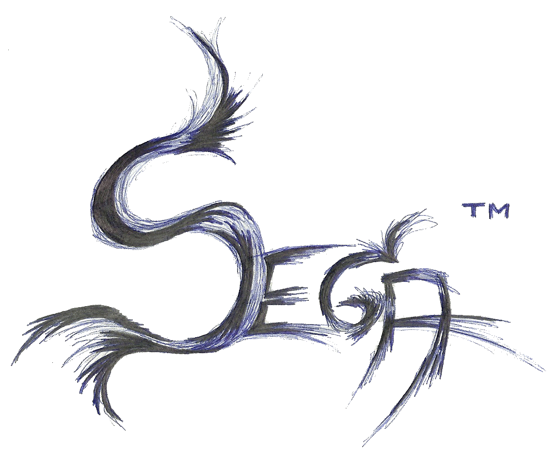
My Sega Intro Test. I don't like the look of the running so i will be re drawing that to make it look better for ma final.


Subscribe to:
Comments (Atom)